A Human-First POV on Social and Why Most Brands Get It Wrong
Brands are producing more social content than ever.More posts. More formats. More trends. More volume.
As we enter into a new decade, it’s clear that marketing to the LGBTQ+ community has come a long way. The LGBTQ+ community is no longer a niche market, but an influential group whose voice grows stronger all the time. However, when it comes to how we speak to and represent LGBTQ+ people through marketing and design, there is still work to be done. To understand and appreciate how far we’ve come in regards to LGBTQ+-focused design, it helps to first take a glance at where we came from.
This past year marked 50 years since the Stonewall Riots, a moment that had a huge impact on the design language of the LGBTQ+ rights movement as it progressed over the following decades. Defiance shown during the Riots set the stage for a shift in the tone and visual language of LGBTQ+ imagery / campaigns and has come to symbolize the spirit of LGBTQ+ equality.
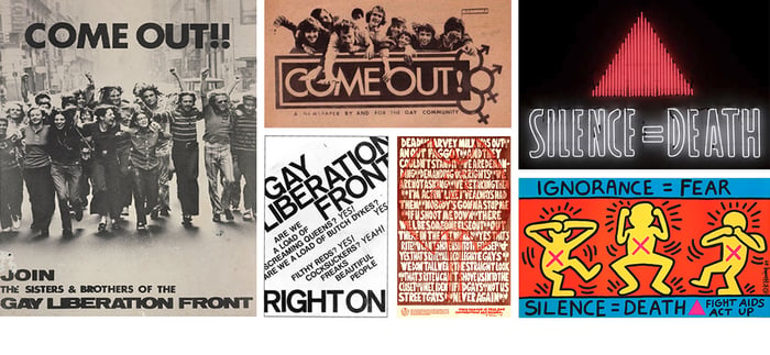 Left: Gay Liberation Front Poster, c. 1970s; Top Middle: ComeOut!, 14 November 1969, was the first publication of the Gay Liberation Movement; Middle Left: Gay Liberation Front Poster, c. 1970s; Middle Right: Poster by Come! Unity Press, New York City, c. 1979; Top Right: Neon version of the famous AIDS slogan ‘Silence=Death’ displayed in the lobby of the Smithsonian Institution’s Hirshhorn Museum; Bottom Right: Postcard used as promotional material for the AIDS Coalition to Unleash Power (ACT UP), featuring an illustration by the artist and activist Keith Haring
Throughout history, symbols have been used to represent the LGBTQ+ community and display unity, allegiance and support among the group. One of the most prevalent today is The Rainbow Flag, designed by Gilbert Baker in 1978 as a positive symbol of inclusion and hope for the LGBTQ+ community. The original version of the flag had eight colors, which stood for sex, life, healing, sunlight, nature, magic/art, serenity, and spirit. The flag was eventually reduced to seven colors because hot pink dye was not commercially available for mass production, and the 1979 Pride Parade Committee eliminated indigo so it could divide the colors evenly along the parade route. The six-color flag is now the most common of many rainbow variations, all of which symbolize the diversity and inclusiveness of the LGBTQ+ movement. While the rainbow flag works as a general flag for all LGBTQ+ people, there are now many more flags that represent the different subsets of the community.
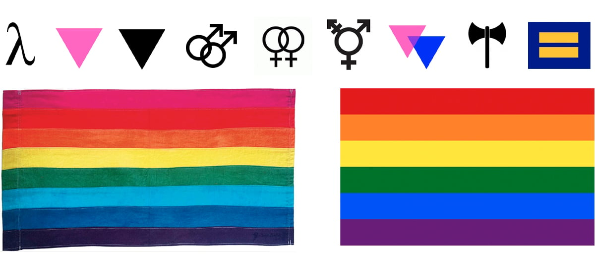
Top Row: Lambda (represents Gay Liberation), Pink Triangle, Black Triangle, Double Male Symbol, Double Female Symbol, Transgender Symbol, Biangles (represents Bisexuality), Labrys (represents Lesbian feminism), HRC equality symbol; Bottom Row: Original eight-stripe version designed by Gilbert Baker (1978) and standard six-stripe version
Over recent years there’s been a dramatic shift in positive feeling towards the queer community, and LGBTQ+-focused design is taking on a broader meaning. Large companies are no longer afraid to associate with the LGBTQ+ community, and we’ve seen an expanding list of brands coming out with smart, creative and inclusive marketing campaigns. However, authenticity is key to businesses standing out amongst the "Pride clutter” and it takes more than just creating a rainbow version of your logo to make an impact.
As pride month rolls around, everywhere you look there seems to be a rainbow advertisement. While seeing this support is great, many organizations aren’t doing much beyond simply flying the rainbow flag. Instead of just changing your logo to a Pride version it’s important to think outside of the box in a more proactive approach. Using the rainbow in your advertising is definitely still acceptable when done in an innovative and creative way, but you have to walk the walk to really make the right impact. Smart brands are giving back 100% of their profits from Pride-themed sales to LGBTQ+ organizations and many support LGBTQ+ causes year-round.
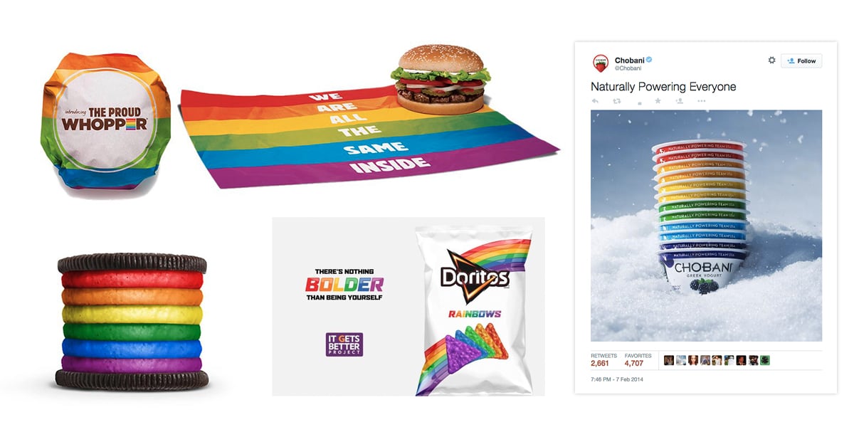 Burger King ‘Proud Whopper’ Campaign; Oreo Pride Ad; The Doritos brand, in partnership with the It Gets
Better Project, launches Doritos Rainbows chips; Chobani social post
Brands don’t have to splash rainbows all over their LGBTQ+ marketing imagery to leave a big mark. Sometimes taking a quiet, yet powerful approach with the use of proper imagery and creative copywriting can push you in front of the crowd.
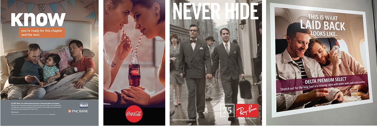 PNC Bank LGBT Ad; Coca-Cola #Loveislove Campaign; Ray-Ban "Never Hide" Campaign; Delta Airlines Poster
Many brands are putting more focus on togetherness and love for all. The idea of acceptance and kindness can visually radiate to the widest span of people in a rally to come together.

Kellogg's creates 'All Together Cereal' to support LGBTQ anti-bullying campaign; The Ad Council achieved viral success with its “Love has no labels” campaign promoting diversity and inclusion; HBO LGBTQ Social Post
Laughter goes a long way in the LGBTQ+ community. You can’t forget the power of humor and the effect it can have in drawing a consumer to your brand.
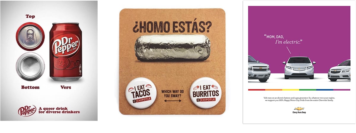 Dr. Pepper LGBTQ ad; Chipotle'Homo Estás' Ad Campaign; Chevy Volt Gay Pride Ad
Although we have come a long way with an LGBTQ+ presence in marketing, we are really only at the beginning of a larger LGBTQ+ advertising movement. With advances in equality on a number of fronts, increased visibility in the media, and a changing mindset of younger generations, the LGBTQ+ community is going to make a much bigger splash on mainstream marketing in years to come.
In the fast-paced digital age where more and more ads and products are being personalized, consumers also expect more from brands. Consumers want to see themselves and the people they care about reflected in the products they buy and the advertisements they see, and only brands doing this will survive. I predict in the next few years we'll see a more inclusive LGBTQ+ representation in mainstream media.
As terms associated with sexual and gender identities and terminology continue to evolve, a shift in the look of LGBTQ+ inclusive advertising will take place. Photography in advertisements will begin to feature richer representations of trans and non-binary people, and gender color norms in imagery will play less of a role. I believe we will continue to steer more towards a gender-inclusive future, where no one will feel ignored or misrepresented.

Brands are producing more social content than ever.More posts. More formats. More trends. More volume.
Innovation is essential for long-term growth. Yet despite big investments and bold ambitions, many companies continue to fall short. Why? Because...