A Human-First POV on Social and Why Most Brands Get It Wrong
Brands are producing more social content than ever.More posts. More formats. More trends. More volume.
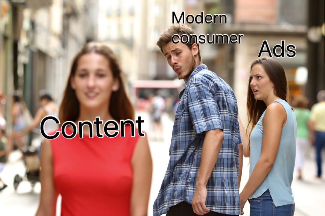
It’s no secret that most consumers hate ads, and despite this universal distaste for pesky interstitials and stale banner ads, marketers continue to crank out these traditional forms of advertisements. If you ask most industry professionals why they continue to deploy banners, there’s a good chance you’ll hear, "I don’t love ads either, but they work and are trackable, especially if the creative is good."
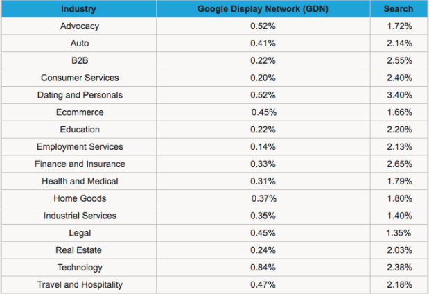
I decided to pull some of the data and trends about traditional ads.
4. Social sites that run ads, such as Facebook, have started to prioritize ads and boosted posts that are mostly image based and lighter on text. The generally accepted rule for Facebook ads, is the graphic should be under 20% text in order to reach the maximum audience for the allocated budget. This 20% rule helps ensure a more user-friendly experience.
5. Consumers have gotten so good at clocking ads in their Facebook and Instagram newsfeed that they are able to scroll past this content, knowing it is an ad, without even thinking. Super cool for psychologists, not so cool for marketers.
Despite some of these stats, it’s not all "Bad News Bears" in the banner ad world. Check out this example of a dynamic banner ad we created for the B2B group at Showtime.
This fast-paced Ray Donovan banner immediately draws your attention in with needed shock value. Because consumers see thousands of ads a day, you need capture their attention with something eye-popping right away. This particular ad saw a 3.4% CTR, which is almost unheard of.
If ads that are commonly thought of as interruptive are proving to be somewhat effective, can you imagine how effective modern ads that are properly integrated into the platforms on which they are run would perform?
This trend has been around for a little while now, but not many companies have hopped on board. Below I have some examples of good and bad Instagram ads across two key industries in the ad game. Although I have chosen to focus on IG, these trends are applicable to Facebook and other like platforms.
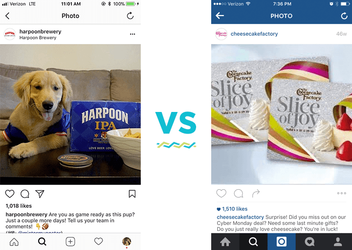
The Harpoon Brewery ad is a much better experience for Instagram than the Cheesecake Factory ad because the photo of the dog much more closely resembles the type of content people choose to engage with on Instagram than does the photo of two gift cards. Unfortunately for Cheesecake Factory, our brains have been trained to scroll past promotions like these because our brain knows the content is not engaging.
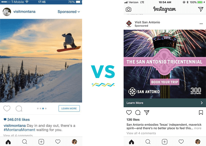
I recently got served the San Antonio ad on Instagram and scrolled past it almost without a second glance. However, this visit Montana ad sings a much different tune, it’s exactly what people have come to expect on their Instagram newsfeed. It’s vibrant, colorful, and makes you want to see more.
Many companies are afraid to use this type of advertising because the photo itself doesn't actually have any brand specific content in it. While the Montana photo definitely does not directly promote Montana tourism, they cleverly used the caption to brand this photo as a #Montanamoment. They also have their handle (visitmontana) and the ability for people to visit their page to promote their brand.
The time has come for marketers to wake up. We need to put ourselves in the consumers shoes and create ads we would want to see ourselves!

Brands are producing more social content than ever.More posts. More formats. More trends. More volume.
Innovation is essential for long-term growth. Yet despite big investments and bold ambitions, many companies continue to fall short. Why? Because...