A Human-First POV on Social and Why Most Brands Get It Wrong
Brands are producing more social content than ever.More posts. More formats. More trends. More volume.
2 min read
 Steven Cortese
:
Jun 4, 2021 2:16:08 PM
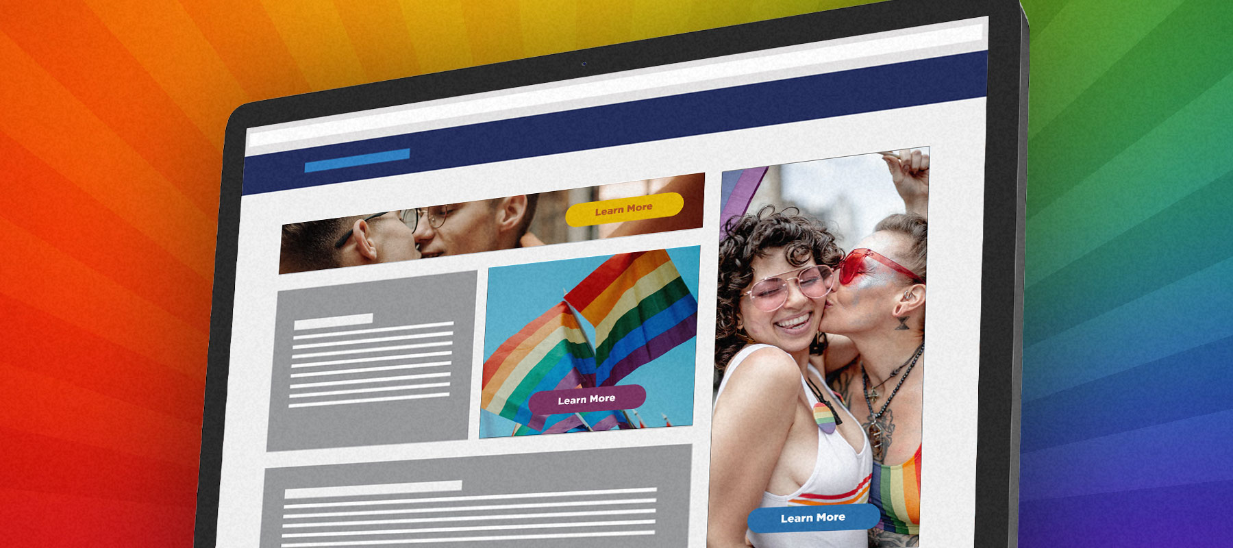
Display ads (commonly known as banner ads) are commonplace in modern digital advertising. They’re often pretty affordable to develop and remain integral to many media expert’s campaign recommendations. Targeting with display advertising has gotten so precise, and with practices like whitelisting sites*, you are almost guaranteed to reach your ideal consumer.
Over the years, I’ve been increasingly interested in LGBTQ+ creative and campaigns and wanted to index banners that have been served to me - both from a consumer standpoint and from a marketing perspective. Here are some ads I have captured and a short discussion about what I liked and didn’t like about them.
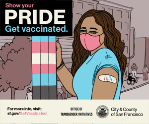
Like: I loved how the illustration really popped off the page. The trans colors and person in the wheelchair in the background really show the inclusiveness mindset set of the marketing folks that worked on this.
Dislike: Some of the information at the bottom of the banner gets lost at this size.
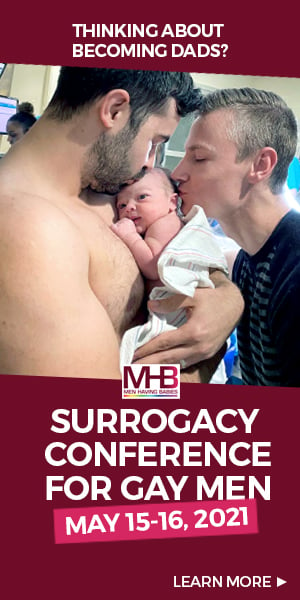
Like: The image certainly grabbed my attention as is unlike most other banner ads I see.
Dislike: Some of the design choices felt a little haphazard and not very professional. It made me question the legitimacy of the advertiser.

Like: The photography used in this banner (and across all banners for this campaign) stares you down, but in a good way. It’s almost begging you to look at it.
Dislike: The CTA is lacking necessary info, most notably the time to tune-in.

Like: The ad has a grungy, queer aesthetic without anything overtly queer in it - a nice change of pace from many other LGBTQ+ ads.
Dislike: Some of the design choices are a bit strange visually and throw off the balance of the unit.
Gif animations are a great way to add some visual excitement to your banners without making the file size too big or without adding complex code.
Like: The slight nod to pandemic safety shows that the ad is timely and aware.
Dislike: The text on the right side of the unit is really small and almost illegible. Also the photo cropping isnt allowing for much visual excitement.

Like: The copy is clever and speaks to a queer audience nicely.
Dislike: The floating CTA is only on one frame of the gif. It would make more sense to have it on both frames.
Like: The animated illustrations are cute and I really like that the animator incorporated all the necessary medical language without it being too intrusive .
Dislike: Some of the designs feel a little cheap to me.
Like: The diversity featured in the ad feels natural while also being inclusive.
Dislike: With so much available to designers within the HTML5 framework, the ad could have been so much more captivating
There’s so much to consider in your media strategy, which can be a little overwhelming to carve out time and budget to run display ads targeted to the LGBTQ+ audience. But if you want to reach them, this is an extremely effective tool if done correctly. Reach out to us if you want to discuss more!
*A Whitelist is a list of website domains that the advertiser is willing to serve its ads on (definition provided by gourmetads.com)

Brands are producing more social content than ever.More posts. More formats. More trends. More volume.
Innovation is essential for long-term growth. Yet despite big investments and bold ambitions, many companies continue to fall short. Why? Because...