A Human-First POV on Social and Why Most Brands Get It Wrong
Brands are producing more social content than ever.More posts. More formats. More trends. More volume.

I had the pleasure of attending a conference in London that was organized by Nielsen Norman Group (NN/g), world leaders in research-based user experience (UX) and the forefathers of Human-Computer Interaction (HCI) and UX. I attended five days, and upon passing all five exams, received a UX certification with a specialty in Interactive Design.
I had two conference goals. The first was to meet and brainstorm with other individuals who care deeply about user research and using research data to dictate design decisions. The second goal was to expand our offerings as an agency by learning time-tested methodologies such as user interviewing, creative ideation, user testing, and applying design principles to solve UX problems.
UX means User eXperience, or more specifically to what we’re doing, the study of how humans interact with computers. Good UX is when a machine functions in a way that matches the user model; or, what the user expects to happen will actually happen. Bad UX is the opposite.
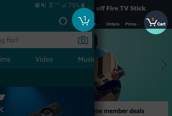
Here are some examples of good UX. Amazon’s shopping cart persists across platforms. If an item is added to the cart, it will be there on the website and on the Amazon app. Another example is the trashcan metaphor. When a file or email gets deleted, it gets moved to the trash. Common convention (the user model) expects that if a trash exists, items can be restored by removing them from the trash, or that emptying the trash will delete the items permanently.
 Good UX: Persistent shopping cart on Amazon’s app and website.
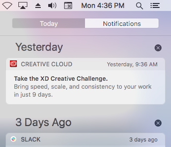
Here are some examples of bad UX: forms that do not save the values in the event of an input error (ever have to keep retyping your credit card number each time your billing address gets rejected?); using colors only to show an active item; reversing the order of “Submit” and “Delete” buttons; just to name a few.
 Bad UX: Color is the only signifier as to which tab is selected, especially if there are only two options. Do you think “Today” or “Notifications” is the active tab?
We have a great team of creative professionals doing some amazing design work, and by infusing NN/g training into our processes and procedures, our work will only get better. Every day is a learning process, and we all thrive when we’re taking in new information and refining our craft.
Let us work with you to make sure your website or app is helping, not hurting, your users.

Brands are producing more social content than ever.More posts. More formats. More trends. More volume.

Innovation is essential for long-term growth. Yet despite big investments and bold ambitions, many companies continue to fall short. Why? Because...