A Human-First POV on Social and Why Most Brands Get It Wrong
Brands are producing more social content than ever.More posts. More formats. More trends. More volume.
2 min read
 Beau Moss
:
Jan 6, 2021 11:13:44 AM

2020 was a horrible year, to say the least. Amongst a pandemic, racial injustice, and political disaster, some people took the time to re-evaluate many aspects of life, particularly when it comes to how we connect with others. This past year completely changed consumer behavior, and many businesses were forced to close their doors permanently. However, some were lucky enough to have the means to move forward in new innovative ways. With hope for a better tomorrow, several companies chose to move into 2021 on the right foot with a rebrand. Let’s take a look at some well known brands that are entering the new year with a fresh face.

Some would say a rebrand for GoDaddy was way overdue. The updated logo combines the letters G and O to form a heart-shaped monogram. The new mark is a needed shift in positioning for the company, and elicits a more welcoming emotional response.

The Popeyes rebrand translates it’s Louisiana roots with a more modern approach. The new-look is a more simplified version of the classic logo, which was meant to be playful and jazzy, representing its New Orleans roots where the brand first launched in 1972. Along with an updated logo and wordmark, the color palette was simplified to a bold, bright orange.

Intel is shaking up its branding with a new typeface and simpler styling, aiming to modernize the brand. The overall design has been simplified, dropping its circular swirl. The color palette remains blue, but with extended variants.

Fisher Price’s new logo is a more playful and flexible version of the old one. The four-piece container was reduced to three semi-circles, symbolizing the three founders. Additionally, the wordmark was redrawn and altered to be more aesthetically pleasing.

As the Durex brand has shifted to become more sex-positive and inclusive, the logo got a much-needed refresh. The logo has been flattened and simplified pill shaped, single-line logo. To top it off, the rebrand features a new typeface named ‘One Night Sans’.

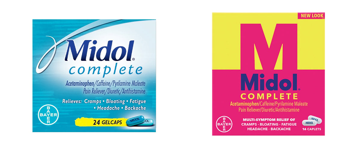
Midol is relaunching the brand for a new generation. The new logo and package design is bold with contrasting colors, including a shiny, bright yellow and matte hot pink, made to stand out to today's strong, confident women.

HelloFresh updated its logo, rendering the brand name in bold new wordmark, alongside an update of its customary lime icon. Although the familiar lime has been retained from the original design, the icon is different, introducing a speckled texture.
Are you questioning whether a rebrand this year may be right for you or your company? We can help you decide. Whether you end up going with a logo redesign, a website redesign, some refreshed messaging or a complete brand overhaul, we can guide you with the best strategy for building a brand that gets it right this time.

Brands are producing more social content than ever.More posts. More formats. More trends. More volume.

Innovation is essential for long-term growth. Yet despite big investments and bold ambitions, many companies continue to fall short. Why? Because...