Traveling as an out and proud gay person can often be quite scary. Studies have shown that although LGBTQ+ people want to be integrated into mainstream travel marketing messages, they often want a place dedicated just for them - to know that destinations are extra welcoming. But even with this overwhelming evidence, many destinations still neglect the LGBTQ+ sections of their website, or don’t even have one at all. However, a few cities stand out for all the right reasons, here are some of my favorites.
San Francisco
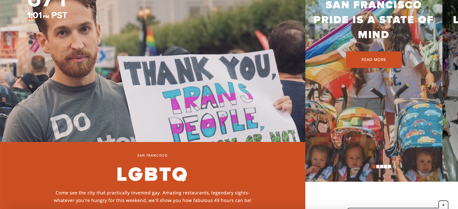
- They are current and are aware of the world. The first image you see on the landing page is a person at a rally holding a sign thanking trans people. Imagery that is inclusive and relevant shows SF is listening.
- Abundance of itineraries. These itineraries are not just taken from other parts of the website and added to this lander. Some of these are specifically built out for a queer audience. Check out one on San Francisco must-sees here.
- Fun playful copy. “Come see the city that practically invented gay. Amazing restaurants, legendary sights- whatever you're hungry for this weekend, we'll show you how fabulous 49 hours can be!” The website copy is fun and engaging, it shows they aren’t stiff.

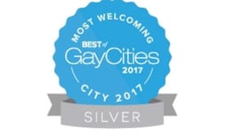
- Leverages Awards. The badge displayed towards the top of the page shows that NOLA was designated the 2nd most gay friendly city in the world. Accolades like this show visitors that LGBTQ+ people actually feel welcomed in the city and the destination is more than just talk.
- Tons of relevant content. Sections are made for families, bargoers, the trans community and so much more.
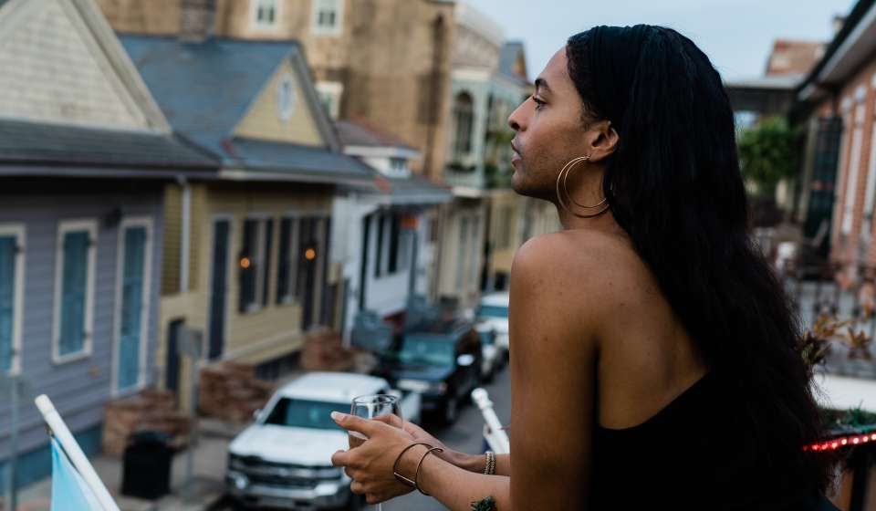
- Photos are plentiful and diverse. There are tons of high quality images that represent the wide range of queer people in the city.
(Photo courtesy of Visit New Orleans)
- Video Content is Queen. This LGBTQ+ lander uses videos extremely well. They leverage video at the top of the page as the first thing users see but use even more video content as you scroll through.
- Detailed Information. Certain sections like the LGBTQ+ bars and the gay resources section are very thoroughly written and have lots of info all in one place.
- User generated content. Above the fold on the LGBTQ+ landing page is a collection of user generated Instagram images. All these images link to different resources on the page. It’s nice to see destinations use real LGBTQ+ people for content.
- Comprehensive download. Austin has an incredibly detailed and useful LGBTQ+ download that they encourage you to interact with on their site. The guide is 45 pages of cute designs, info on what to do in each month of the year, and so much more.
- Copy that shows acceptance. ‘We’re here, we’re queer. We’re used to it’ is the first headline on the LGBTQ+ lander. This is a bold and beautiful headline.
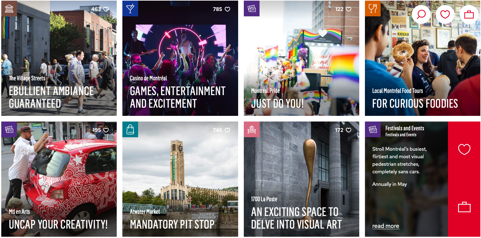
- Very specific content. There’s content for drag lovers and female specific content that is very easy to find. There’s also a ton on Pride history and why Montreal is a queer mecca.
As demonstrated by the 5 sites above, there is no right way to design your landing page. Depending on how the site is built, there may be limitations to what content looks like and how photos can be used, but no matter how the site is built, I have two take away recommendations. First, make sure there is strategy behind the landing page and know what you want users to take away from it. Second, don’t neglect your LGBTQ+ page, many visitors will use it to decide if they feel safe in your destination and this page can make the difference between coming and not coming to visit you!

*Disclaimer - My team was behind the look and strategy of this website

