A Human-First POV on Social and Why Most Brands Get It Wrong
Brands are producing more social content than ever.More posts. More formats. More trends. More volume.

We recently had a client approach us for some design work who told us that they did not want a script font on their design due to the fact that some people could no longer read cursive. At first this seemed to be a somewhat jarring and comical statement, but then they continued to explain that the younger generations have not been learning cursive in schools for some time now.
In 2010 Common Core standards removed cursive instruction as a requirement, which meant in most states, teachers weren’t obligated to teach it. Many of them stopped. The decision makers wrongly believed cursive is an outdated system of communication, whose value ceases to exist in a digital society. They argue that teaching typing skills, which is undeniably important, will help students succeed in careers and in school than it is that cursive will. Some even consider it a dated form of writing and think that school hours are better spent on other subjects.
While this sparked a heated debate among parents, educators, historians, and sociologists there has been little heard from the design community. The truth is it could have quite an effect in the design and advertising realm. If future generations continue to abandon cursive, how will that change the way we think about and interpret design?
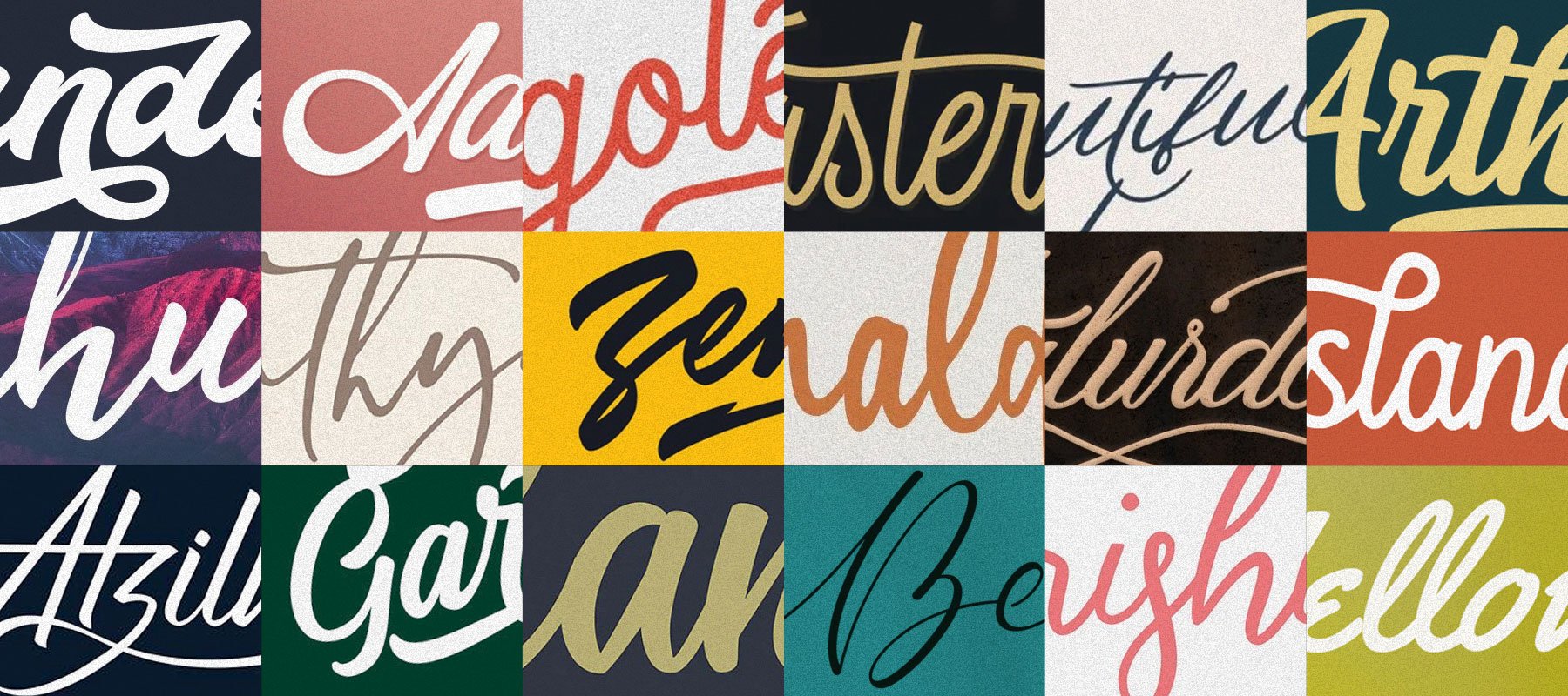
Cursive is a beautiful art. The word calligraphy is derived from two Greek words: kalli, which means beautiful; and graphia, which means writing. Cursive has the added benefit of being both artistic and highly personal, allowing people to express their individuality and creativity. It adds voice to our designs that is timeless and historic, but also intimate, formal, and sophisticated.
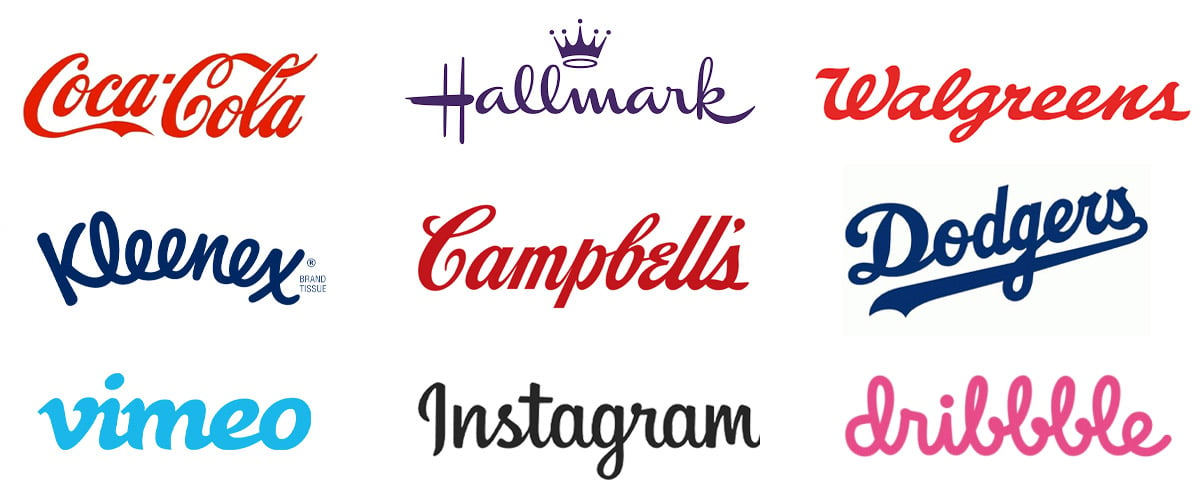
Throughout time cursive and script writing have been used in designs we see and relate to daily. Did you know that the original Coca-Cola logo was written in an early form of American cursive called the Spencerian method? Many of us take for granted the cursive we see advertised every day in logos like Ford, Hallmark, and Walgreens. Even today, web and technology companies are using cursive in their logos: Dribbble, Vimeo, Pinterest, Instagram.

Cursive logos can often be recognizable as artistic marks from repetition of seeing them, but what about cursive writing integrated into designs where a viewer would be required to read a phrase or headline? As a designer that appreciates the beauty in cursive letterforms I urge parents and teachers that can to continue to teach children to learn to read and write cursive. I have personally asked several parents that I know who say they DO teach it to their children outside of school. We are still only at the beginning of what seems to be a slow decline in teaching cursive, but there is still hope that we don’t become a society that phases it out.
Do you have a business with a cursive logo or do you use it in your advertising? If so, please don’t let this article worry you but let it inspire you. In fact, you may be helping to keep this style of writing alive. If you have questions about your brand or want to discuss further please let us know!

Brands are producing more social content than ever.More posts. More formats. More trends. More volume.

Innovation is essential for long-term growth. Yet despite big investments and bold ambitions, many companies continue to fall short. Why? Because...