A Human-First POV on Social and Why Most Brands Get It Wrong
Brands are producing more social content than ever.More posts. More formats. More trends. More volume.
5 min read
![]() Phillip Dodson
:
Apr 30, 2020 7:54:42 PM
Phillip Dodson
:
Apr 30, 2020 7:54:42 PM

Recently, there’s been an influx of people working from home and spending more time on the internet, so make sure your images are working for you from both an accessibility and search engine optimization (SEO) perspective. The advice commonly thrown around is to always include ALT text in all images. In this article, we’ll discuss what ALT text is, how to write it, and if you really do need to include it on all of your images.
Simply put, ALT text is the ALTERNATIVE textual representation of an image. A good trick to help illustrate this concept is to imagine verbally describing an image to someone who cannot visually see it (more on that later). While on the surface this sounds like a caption, ALT text functions differently than a traditional caption like you may see on Wikipedia. A caption provides additional information about an image whereas ALT text represents the image. Let’s look at an example.
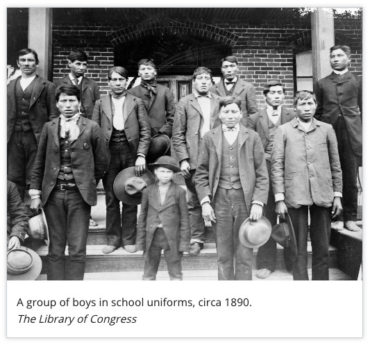
The above photo, found on the Native American History Timeline on the History website contains an image and a caption underneath that provides context to the image that reads “A group of boys in school uniforms, circa 1890…” The caption provides a vague sense of quantity and a general age group — a group of boys — and a estimated point in time. Now, if we had to describe this image to someone, we could say something like this: “A black and white photograph that contains 13 Native American boys standing on steps in front of a school.” This text could stand in place of the image, while still allowing the caption to provide extra information.
The largest benefactors of ALT text are users who utilize assistive technologies such as screen readers and braille displays. ALT text offers website owners an opportunity to provide text that can be communicated by the device to the user when sight is a limited option or not an option at all.
For screen readers, if ALT text is not present, the software has to make a decision on what to read. Different screen readers handle this situation differently. JAWS, the most widely used screen reader, says literally "Blank" if the image does not contain ALT text. NVDA, the popular free option for Windows, skips the image altogether, and VoiceOver, the built-in screen reader for macOS and iOS, reads out the filename of the image, letter by letter, e.g. "el-oh-gee-oh-dot-pee-in-gee." The following video is a demonstration that shows how VoiceOver handles the different situations with images and ALT text.
Civil rights and moral issues aside, there’s also been a renewed interest in catering to accessibility standards in the last few years due to U.S. courts started ruling in favor of plaintiffs vs. inaccessible websites.
Search engines that cannot find and/or make sense of content will not display that website in search results, and images are an important piece of content for rankings. ALT text on images benefit SEO in two ways.
First, images with ALT text provide additional content on the pages in which they reside. Images act as supplemental content that holds a lot of weight for search engines, and ALT text creates a connection between the image and the page’s content.
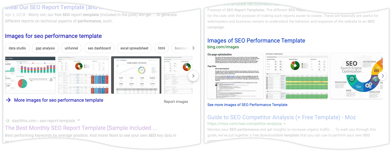
Inline image results for “seo performance template” on Google (left) and Bing (right).
Secondly, Search Engine Results Pages (SERP) show images alongside standard search results. This inline orientation presents relevant images to users without them having to do an image search, further evidence that images hold special weight. ALT text is what allows search engines to find and display these images.
ALT text provides an image description for when an image is not available. This can happen when a user has images turned off, or when the image source no longer exists, such as when an image was accidentally deleted. Instead of showing nothing, the web browser will display the ALT text, so the user has an idea of what’s supposed to be there.
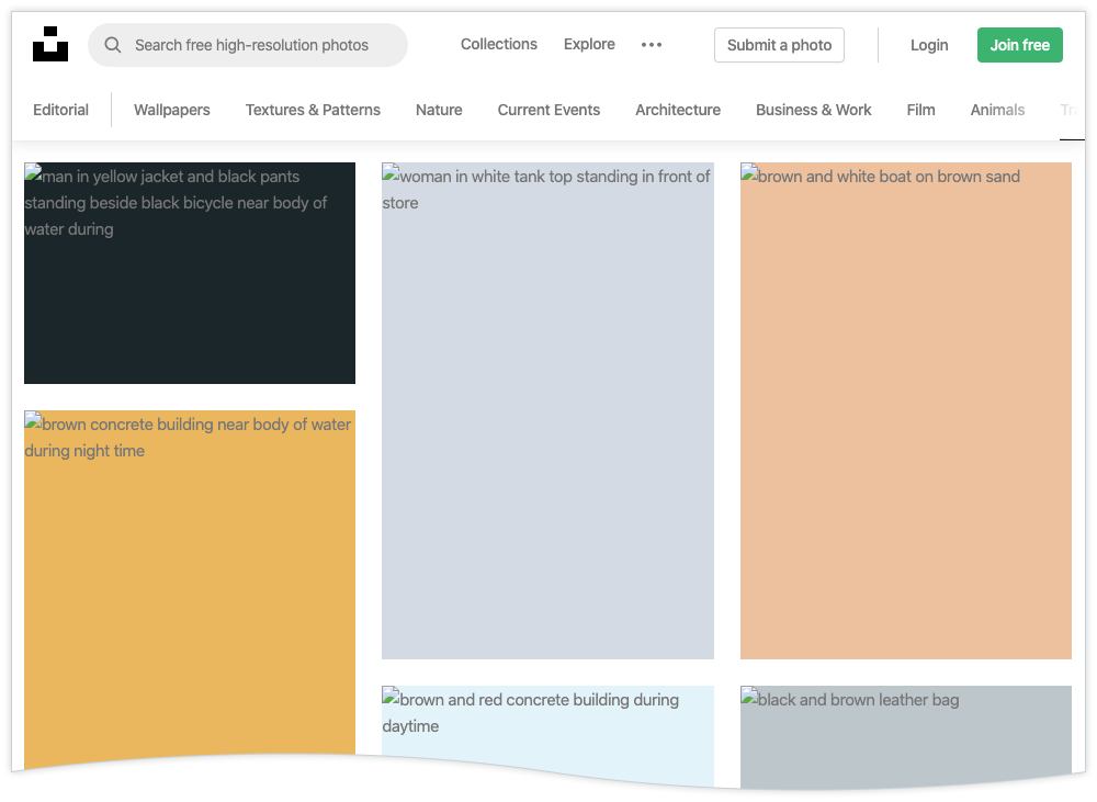
The image above is a screenshot from Unsplash, a website that provides free images. In this example, images have been turned off to demonstrate what happens when images cannot be displayed. In place of each image, the ALT text is displayed and describes what the image is supposed to be.
As an aside, another broken-image example is when an email arrives and the user has images turned off by default. If the author provided proper ALT text, the user could still scroll down the email and get the gist without having to download the images.
Let’s challenge the notion that all images need ALT text, and let’s look at when using ALT text is inappropriate. If used correctly, ALT text creates an inclusive environment for your users who want alternate text. However, when used incorrectly, it can provide unnecessary noise for assistive technology users.
The Web Content Accessibility Guidelines (WCAG, version 2.1 as of this writing), which is the standard for accessibility guidelines, contains numerous success criteria by which a website is to be measured against for accessibility compliance. The very first Success Criterion, 1.1.1 Non-text Content, can appear to insinuate that all non-text content, i.e., images, need alternative text. However, an exclusion is made for non-text content that falls under pure decoration, defined as “serving only an aesthetic purpose, providing no information, and having no functionality.”
In other words, images that are for decoration do not need ALT text written for them. An easy way to determine if an image is purely decoration is to imagine that the image is no longer visible. If an image, when hidden does not break functionality or understanding of the page’s content, then it should not include ALT text. Let’s look at an example.
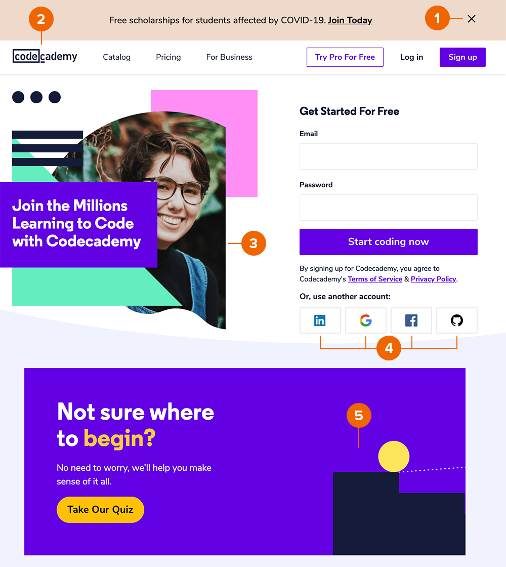
The image above is a screenshot of the homepage for Codecademy, a website that teaches users how to code. The screenshot is labeled with numbers 1–5, each number representing an image on the homepage.
Now, let’s remove all of the images.
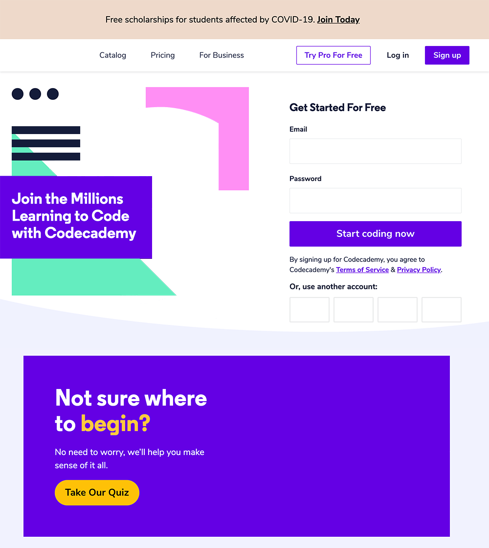
This new image is the bare homepage with all images removed. Using the numbers from the previous screen, let us go through and determine the “pure decoration” images.
The goal of this article is to provide an overview to the benefits, proper writing, and careful consideration of ALT text in images. I try to avoid blanket statements and absolutes because all audiences are different. If you are making informed decisions on ALT text based on your own analytics and user research, then please continue doing what you do. However, if you’re just starting out with a new website, or if you currently have a website and are unsure on how to make your images more inclusive and SEO friendly, this will provide a good baseline.
Let us help you with your website accessibility.

Brands are producing more social content than ever.More posts. More formats. More trends. More volume.

Innovation is essential for long-term growth. Yet despite big investments and bold ambitions, many companies continue to fall short. Why? Because...