A Human-First POV on Social and Why Most Brands Get It Wrong
Brands are producing more social content than ever.More posts. More formats. More trends. More volume.
3 min read
![]() Phillip Dodson
:
Jun 20, 2020 3:53:00 PM
Phillip Dodson
:
Jun 20, 2020 3:53:00 PM

Pre-built premium WordPress themes can reduce the initial cost of a website by eliminating the up-front cost of custom page designs and coding. Unfortunately, many of these themes can neglect accessibility standards that can leave a new website difficult to use for a significant audience.
Here is a list of three things we look for regarding accessibility when choosing a premium theme for our projects.
Themes have built-in customization options such as text color and size, background colors, navigation colors, and more, that allow website administrators to change the look and feel of the website through an easy-to-use interface. These customizations are necessary because one theme can be purchased by numerous buyers, and each buyer will have different requirements. All websites that use the same theme would look identical to each other without the ability to change the style of the site. Problems can arise if there are not enough customization options available.
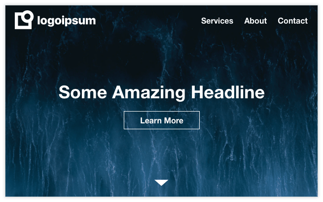
Here’s an example of a common design pattern. The user lands on the home page and is greeted by a large image with some headline text and a button. The website’s logo and main navigation sit at the top overlaying the image. When the user scrolls down, the logo and navigation get smaller and a background color appears behind the navigation area.
 Example home page with logo and navigation overlaying hero image.
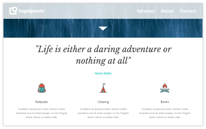
 Home page that's been scrolled down. The white navigation text over the semi-transparent white background makes the navigation difficult to read.
In this example, the theme author added customization options for the navigation text color and navigation background color when the website is scrolled. Unfortunately the link colors cannot be customized when scrolled, so the chosen link color has to work overlaying an image but also with a background color. This lack of customization severely limits the usable color palette and can lead to accessibility issues regarding color contrast and would require a website developer to fix. If you do not have access to a developer, try to use a hero image that is similar in color to the background color of your navigation bar. Read more about accessible color contrast here.
Theme authors, like real-estate agents, utilize curb appeal to help sell themes. When a customer is trying to decide on which theme to buy, they’ll have to sift through sample websites created by theme authors that are meant to demonstrate all that’s possible with each theme. This often means the author will throw everything at the customer except the kitchen sink in an effort to “wow” the customer. Unfortunately, a lot of this curb appeal comes at the expense of accessibility best-practices, especially when it comes to motion and animation.
Elements that fly, grow, fade, or morph onto the screen as the user scrolls is a trend that started around the time that parallax scrolling became a thing. Many themes, by default, have this effect already in place so it gets published along with the new website.
Scrolling animation sample of a typical WordPress theme. This is a screen capture of the theme Azoom.
However, users with epilepsy, motion sickness, or a variety of vestibular disorders can be negatively affected by this movement. In order to pass accessibility compliance for animation (WCAG 2.1, Success Criterion 2.3.3 for those interested), these animations need to be able to be disabled without breaking the web page. Users can opt-in to disable animations globally in macOS or Windows, but often times the animation effects do not have a good fallback when disabled, thus severely limiting the web page’s usability.
A good rule of thumb is to turn off all animations in the theme, then selectively add motion when it directly enhances the content while also testing to make sure it works when the user has chosen to reduce motion. Here's more information on the reduce motion settings for multiple operation systems.
Proper HTML structural code is important for (at least) two reasons. First, it provides context for external tools such as search engines about the content and structure of your website. Secondly, it's important for accessibility because proper structure provides assistive technology with clues and landmarks about how to navigate the web page. Here's a video demonstrating VoiceOver, the built-in screen reader for macOS.
An example of this is dealing with page headings. Most WordPress themes use some sort of page builder plugin, so adding a page heading is as easy as dragging a heading module to the page and typing in your page heading text. There are potentially a few problems that can arise, however.
Page headers in HTML consist of header tags with levels 1–6: <h1>, <h2>, <h3>, <h4>, <h5>, <h6>. The numbers represent levels, such as in an outline. So, for example, the Wikipedia entry for dog contains the following headers with the outline level denoted in parenthesis:
Depending on which page builder plugin the theme is using, you may not be able to select the level for your heading, thus providing an inaccurate page outline. Another problem is that themes will have a default font size, color, and style for each heading level but the heading module will not allow that style to be changed, so the page author will select the heading level based on how they want the heading to look instead of choosing the proper heading level and restyling it.
Unless you know what to look for, the initial savings of using a pre-build premium theme can easily be eaten up by making the theme meet minimum accessibility compliance. On projects where we're using premium themes for clients, we handle this accessibility inspection up front so the finished website launches on budget and is accessible

Brands are producing more social content than ever.More posts. More formats. More trends. More volume.

Innovation is essential for long-term growth. Yet despite big investments and bold ambitions, many companies continue to fall short. Why? Because...