A Human-First POV on Social and Why Most Brands Get It Wrong
Brands are producing more social content than ever.More posts. More formats. More trends. More volume.

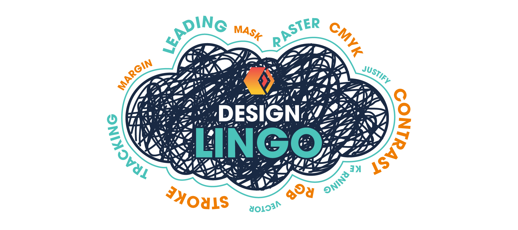
Ever been confused when talking to a Graphic Designer, and you just smile back not knowing what they are talking about? Don’t worry, I’m here to help you sift through the jargon. As a Graphic Designer, speaking this new language pretty much becomes second nature, but when talking with clients, this can be quite daunting and lead to complications during the design process. A widow and orphan are not what you think. Leading? What in the world is leading?
In a series on our Instagram page titled “Design Lingo”, I post quick & easy animations explaining the basics in design terminology. This is meant to help amateur designers and non-designers alike. We do have more in-depth discussions on some design terms like color modes: PMS, CMYK, RGB, & HEX and the differences between them. So get ready to talk design lingo with the best of them in the near future.
Tracking is the typography term for letter-spacing. Changing the tracking can help when letters look too cramped together or too spaced apart. It can also help blocks of text look even throughout a paragraph. I must warn you, tracking can often get confused with kerning. Even though they are similar, tracking is the spacing of an entire word or paragraph while kerning is the spacing between specific letters.
Let’s talk about the typography term “leading” or line spacing. Pronounced “ledding”, it’s generally measured as the distance between one baseline of type to the next. Adjusting the leading is one of the quickest and easiest tweaks you can do to instantly make lines of text look better. Finding that sweet spot between too tight and too loose is key.
Margins are the spaces between the edge of a page and the content within it. This can ensure that everything, but especially copy, sits properly in a design. This also can help your design look neater and more professional at the end of the day.
Widows are the lines of text that are separated from the main body of a paragraph—usually the end of a paragraph that goes over on to a new page or column, or the opposite of that, the start of a paragraph that is at the very bottom of a page. Widows can be the biggest headaches in the world.
A widow’s BFF, orphans are a single word (or two or three words) that sit on its own on a new line or new page/column. Like widows, they can be just as frustrating and have you looking at the screen with a blank stare for several minutes.
Now yes, these are just a few terms to hold you over and not overload your brain but be sure to check out the Boombox Instagram for more quick & easy “Design Lingo” animations updated regularly to help further your Graphic Design knowledge in order to go toe-to-toe with the best of them. Are there any Graphic Design terms you want to see animated? Make sure to leave a comment below.
Want to chat about branding your company?

Brands are producing more social content than ever.More posts. More formats. More trends. More volume.

Innovation is essential for long-term growth. Yet despite big investments and bold ambitions, many companies continue to fall short. Why? Because...